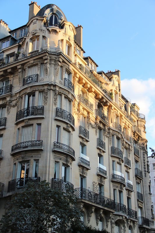
Many Parisians dream of living in an old ‘Haussmanian’ building. The style is named after Baron Haussman who, under the orders of Napoleon III, redesigned Paris: widening avenues; rationalising streets and famously aligning the tall imposing Parisian façades .
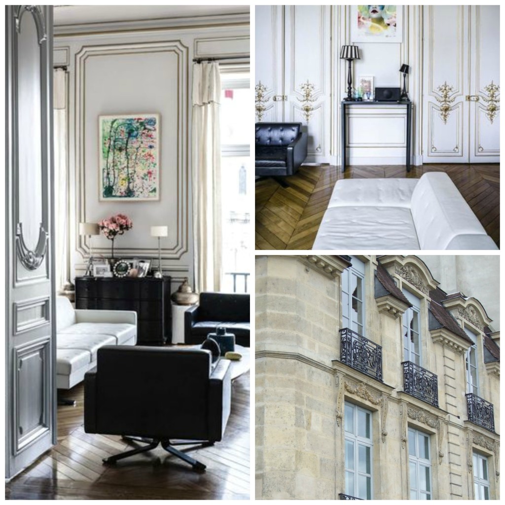
Today the Haussman building is still found all over Paris. On the outside we recognise the rounded corners, the balconies, the horizontal lines that flow from one building to the next. The wide doors opening onto interior courtyards and porte cocheres, and the beautiful oval oeil de boeuf windows on the zinc rooftops.
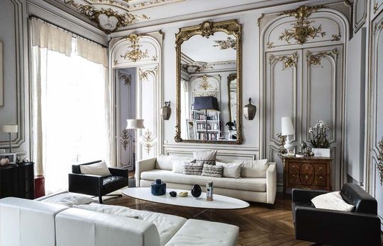
Inside these buildings the ceilings are high, typically approaching 3 metres, with ornate plasterwork. The floors are beautiful old parquet, often herringbone pattern, and the central stairways lined with marble.
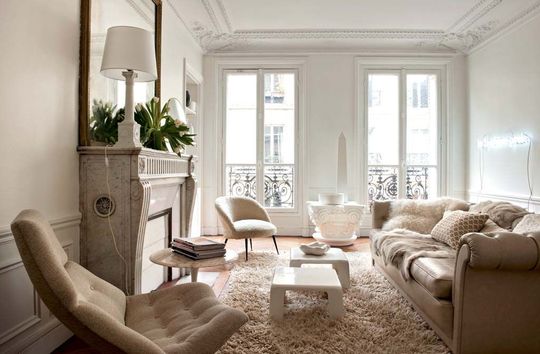 So how does this work for a contemporary family who buys much of their furniture at IKEA? !
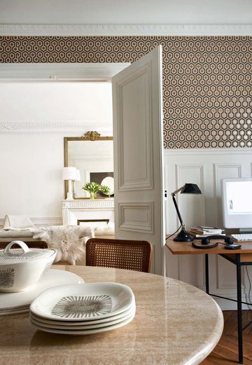 Here are a selection of photos from Coté Maison, showing three apartments that have been redesigned for today’s living, while respecting many of the original features of the old buildings.
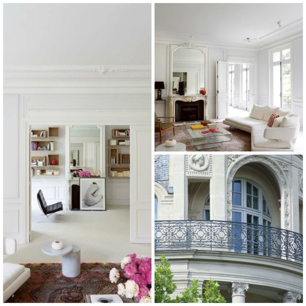 What do think? Do you like to see these 19th century buildings bathed in white and sparsely furnished, or would you prefer to find them filled with antique furniture and beautiful paintings?
all photos with thanks to Cote Maison
[white]

29 comments
Interesting that you mention Ikea. My friends in the 16th all who have inherited “classical pieces”of furniture from their families all say they are tired of that old style and that it is much more practical and interesting to have furniture from Ikea. They feel obligated to keep the inherited furniture even having to have chairs fixed and reupholstered etc. but they much prefer the Ikea style. Their kids (married) all have Ikea, not having any inherited pieces themselves and their parents (my friends) are envious!
I love the old Haussman buildings. They look beautiful with both styles, a testament to Haussman that even the modern Ikea looks great and does not detract from the Haussman style.
I love the simple minimalistic ( though somewhat cold) approach but prefer to see it with the old antiques mixed in. It can achieve a warmer more welcoming feel. Today’s young adults don’t seem to be drawn to antiques like my generation. I want to hold on to my past and my heritage.
Ah ! Paris !!!!!
Paris ne serait pas Paris si Haussman ne l’avait pas imaginé rempli de ces charmants immeubles !
De bien beaux appartements remplis de jolis meubles font le plaisir des yeux et la joie de leurs heureux occupants.
Merci Sharon pour ce reportage original;
bien à Vous,
Mariecapucine
Lovely photos; truly the classic buildings are beautiful no matter the furnishings. For my own home, I prefer a blended style of decorating that mixes traditional and modern pieces.
Beautiful story Sharon…
No need to be a slave to your home’s architecture: minimal furniture can look beautiful in a historic property and antiques can look stunning in a modernist home in my opinion x
I recently read Tatiana de Rosnay’s book _The House I Loved_, which takes place during Napoleon and Haussmann’s demolition and rebuilding of Paris. And, although I am charmed by Haussmanian architecture, I feel the loss (through the reading of the book) of the “old Paris.” I may have liked it better!
As for me, I prefer antiques and lush interiors. I am not a minimalist at all.
I think this may go back to the old feeling, you just want something different from what everyone around you has. I’m a little surprised someone would consider Ikea a good replacement though. I understand wanting simple but what about quality? My preference is a mixture of old with new done in an uncluttered look. Not as easy to achieve as one might think. Life happens in these rooms.
Agree about Ikea. For the lucky ones who can afford to rent or buy a beautiful Haussmanian apartment, why would they want mass produced ordinary furniture like Ikea? Love the warmth and interest of an eclectic mix of antiques and modern, with some clever clutter – but don’t like highly decorated rooms that don’t look lived in and where the books are bought purely for decorative value, often tied up with ribbon or string. They look so phony. A home should look like a home and not just like a showplace. Books, paintings, a few magazines, fresh flowers. Even a dog or two, if the owner loves dogs. Best wishes, Pamela
My problem is I love both styles. I like change, so the answer would be if it was possible to have both! One chic and uncluttered with quality apartment in Paris and one cozy, colorful, filled with memories home in the country. We can always dream…
Beautiful photos- Merci
I love a good mix of antique and contemporary.. keeps things interesting
I knew that Haussman had designed much of the Paris that we know today, but I did not know about all the streets and houses that were destroyed until I read Tatiana de Rosnay’s book The House I Loved. ^Progress came at a cost. That said, I do love the Haussman architecture and I think it can handle both the traditional and the more minimalistic styles of decorating. Individual taste and comfort is so important.
When we visited Paris a number of years ago, we had to visit the dentist on a Saturday morning. On Rue Voltaire, we climbed the stairs of the building to find a lovely dental office in one of the Haussman buildings. Sitting in the waiting room was a delight – bergère chairs, lovely mouldings, a view over the street – like being in a drawing room. Then to go into the treatment room – all white and clinical, with a sort of fibreglass lining that curved around the ceiling, protecting the original architecture, I imagine, while providing a space that could be kept clean. It was fascinating. Everything was white, the treatment chair, the dentist`s chair, the cabinets, even the dentist`s computer. Then, on a counter top, stood a clear glass vase with one stunning blue hydrangea blossom. Just lovely.
I certainly wandered away here, didn`t I?
I am loving the mix of antique + not to much cold modern. xxpeggybraswelldesign.com
Oops. That should be Boulevard Voltaire.
I do appreciate seeing the antiques & the ornate furnishings as well as the paintings, however, a little can go a long way as far as I’m concerned. I do prefer a much cleaner paired down elegance. Having some “white space” is easier on my eyes. Lovely photos Sharon.
How beautiful!
Thank you for sharing these wonderful photos! I find showing how different cultures live creates new perspectives for those in their own home.
Whether it be contemporary or antiques, like people we can all exist together.
What a dream come true to live in a Haussmanian apartment. I think they are beautiful whether decorated in a purely traditional style or something more modern depending on the personalities and lifestyles of the inhabitants. Personally, I like to mix old and new, spare and ornate, so would feel quite at home in any of the examples you’ve shown us here.
Lovely, Sharon. Have a beautiful week! XO
As with others, I prefer a mix of old and new. Older pieces for the sense of continuity, some newer and more spare to give the eye resting space. Pale colors to reflect light, and bright rugs to soften floors. Unless Ikea is much better quality in Europe than in the US, I’d avoid it.
While I prefer classic, I would take it either way. Just gorgeous.
If you have good pieces already, I think it would be a shame not to enjoy them. Needn’t result in full-on late Victorian density. If you haven’t got especially good things, I personally would think Baker or McGuire. IKEA is simple and reasonable. Rather like corn flakes for breakfast.
Beautiful pictures of the wonderful Haussman buildings.
With white or light colors, the high ceiings,and detailed moldings, and windows
some antique pieces with good new pieces(I don’t see Ikea as higher quality furniture here in the US) .How could it be bad?
I also read Tataina de Rosnay’s book which takes place in my favorite arrondisemont of Paris.I never grow weary of walking in this area.To me Paris is like a jewelry box with treasures to be discovered.
I have often wondered what the interior of these buildings looked like…when I was in Paris I was very impressed with their beauty and longed to go inside. Thanks for sharing this so that now I have some idea! In my area of the South, we love our antiques…mostly French and English …. but mixed with modern classic furniture…more of an eclectic look.
Dear Sharon ~ I so agree ~ beautiful pictures of the Haussmann buildings!!! However, I must agree with Ellen, they would be much more glorious filled with antiques and lovely paintings than the modern IKEA type furniture.
Thank you once again for a lovely post!
Barbara
Move-in ready!! Where do I pick up the keys?? Beautiful photos and just our style.
I love these rooms. With the placement of one dark antique piece in each room the modern furnishings warm right up!
Beautiful.
Probably the thing I love most about the French style is its mixability. So while I love French antiques, the mixture of these modern pieces with the architecture is really pleasing, not to mention practical especially if there are ever children in residence.
Really interesting article. Thank you.
So very beautiful. Contemporary fits so perfectly in a period property, probably because of the proportions… Love it <3
sparse is the new fill
The mix of ornate with clean lines allows both to shine. Like a plain linen matte around a delicate watercolor it allows the eye to appreciate the fine detail.Conversely the ornate detail warms the clean lines so the space isn’t frozen.
Attractive portion of content. I just stumbled upon your blog and in accession capital
to assert that I acquire actually enjoyed account your weblog posts.
Anyway I will be subscribing in your augment or even I
achievement you access constantly rapidly.