The truth is that I am working on refreshing this little blog, and oh boy, it is a labour of love…
Font for example! Who would have thought it could be so important?! I am looking at shapes and sizes of letters until my eyes are screaming out for a rest. It’s interesting and stimulating but decisions can be hard to take.
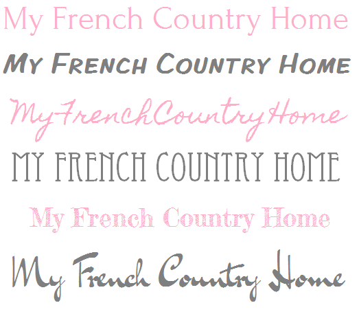
Look at how the blog title takes on a totally different mood with a change in the font.
 So there is my excuse. I like to keep you informed of what’s going on here. Without your support and encouragement, this blog would have no raison d’etre, no meaning at all.
Thank you for your patience, I hope to be able to announce the new MFCH quite soon. And if you are waiting on an unanswered mail, would you mind dreadfully if I asked you to send it again. This time I promise you’ll have a quick reply.
26 comments
Oh Dear, this is the time for refreshing!The evenings are so long and nowedays one has no other job in the darkness than to sit before the computer.
I (the expert actually)have started to make a new homepage for the guest house, more for practical reasons as the one I had was badly hacked,now closed for the public.It is sooo hard to decide the design, the colours,the fonts,select the photos…. I thought I had a definite idea how it should be but looking at the several designs presented by the helpful expert I'm totally lost at the moment. Dorka from the sunny and warm Plain in Hungary http://www.dorottyaudvar.co.hu
I like the second font and color best, and as second choice, the last one. I am sure your blog changes will be charming, as your blog already is.
I like the last one for you…..we're all distracted these days, o boy!
I'm sure you've already chosen the font style, but I too think that the last one is so your blog style. & please DON'T choose PINK.
I have been wanting to change my blog header all summer however I don't know where to start a friend helped me when I first started blogging
I didn't think I would ever get it up LOL and running
I can do the pictures however can't find how to put the lettering like you gave for examples over the pictures?You can teach seniors new tricks with a little encouragement. There are gals a lot older than me that does it, it's all in knowing what to do
Your blog is always so pretty so what ever you come up with it will be wonderful
Hope you don't change it too much, it's quite wonderful as is.
As for font, my vote goes to the sixth and first examples. And in grey, s'il vous plait, not pink. If you do color, perhaps something darker (like a burgundy?), something you can look at over time without eyes complaining.
Please please please……don't change a thing. Your blog looks perfect, as it is. Most of us find it quite
unsettling when a blog changes its' look – even with a font change. A bit like your local supermarket changing all aisles, and moving things around. Yours (truly) is one of the nicest out there. Keep it as is,
s.v.p.
I do not know how you get all everything done. I wish I could achieve half of your schedule.
I need a new theme, but have delayed because of too many decisions. I keep making notes, but I think I am going to need professional help when I get my act together.
Sorry to hear about the hacking Dorka, but I'm glad to know I'm not alone in this!
xx
thank you for your confidence! I'll do my best
x
thank you, it's interesting to know which font you think suits the blog best
xx
Barbara. NO pink. Promise!
x
Thank you for your kind words. You know we all struggle to understand this stuff, but that is half the fun, and the sense of achievement once you grasp it is very satisfying 🙂
xx
Thank you, no not too much change, more of a dusting off
xx
Thank you for the 'perfect'. I just want to de-clutter a little, and freshen things up but don't worry the lay out will be very similar and very easy to navigate.
x
it's interesting that the decor/design blog world is not only about decor….but about computer knowledge and skills, photography, business acumen, networking, computer knowledge and skills, display, verbal and written language competency, computer knowledge and skills, and computer knowledge and skills. Carry on. Love your blog. I am an accomplished reader!
I've not seen the last font style before, I like that one. I think the style suits your blog title.
Betsy
My suggestion would be 3 or 6, but I know you will choose the right one for you. Why is doing something fun so often complicated ?
Sharon, I think the fourth font down looks completely French.
Dear Sharon, Please don't give up the blog. I was born in Paris many years ago. I now live in the U.S I long to go back to Paris I was a child when we moved.
You are the first thing I read every morning. I save them and It makes me feel like I am back in France. I love your blog and those dogs. I have cats. But your dogs that little one last week trying to go under the gate , too funny.
I totally understand how frustrating this process is. Just when I think I've decides the best look for my brand, I see something else that looks interesting. Good luck, I know it will be wonderful.
I know for certain fonts can make the page stand out or not. The skies the limit when it comes to fonts, I know this for certain myself. Frankly Sharon, there are more beautiful fonts out there than any of these. I just always try to be honest. Sprucing up is a good thing, I'm sure you'll come up with something stunning as always.
Second last. Without a doubt.
Good Luck with the freshening up of your blog. I am married to a graphic/web designer…. there must be more fonts than colors in the world. Look forward to seeing your changes.
Sharon I love the 4th font it looks so French to me…
n reading about the challenges of feeling distracted, as beautifully outlined in Sharon Santoni’s blog, it’s clear that such a state of mind can significantly affect all areas of our lives, including how we manage and interact with our healthcare needs. In this digital age, where distractions abound, leveraging technology to streamline and simplify our lives is more important than ever. This is where the innovative application of healthcare cloud solutions can make a profound difference.