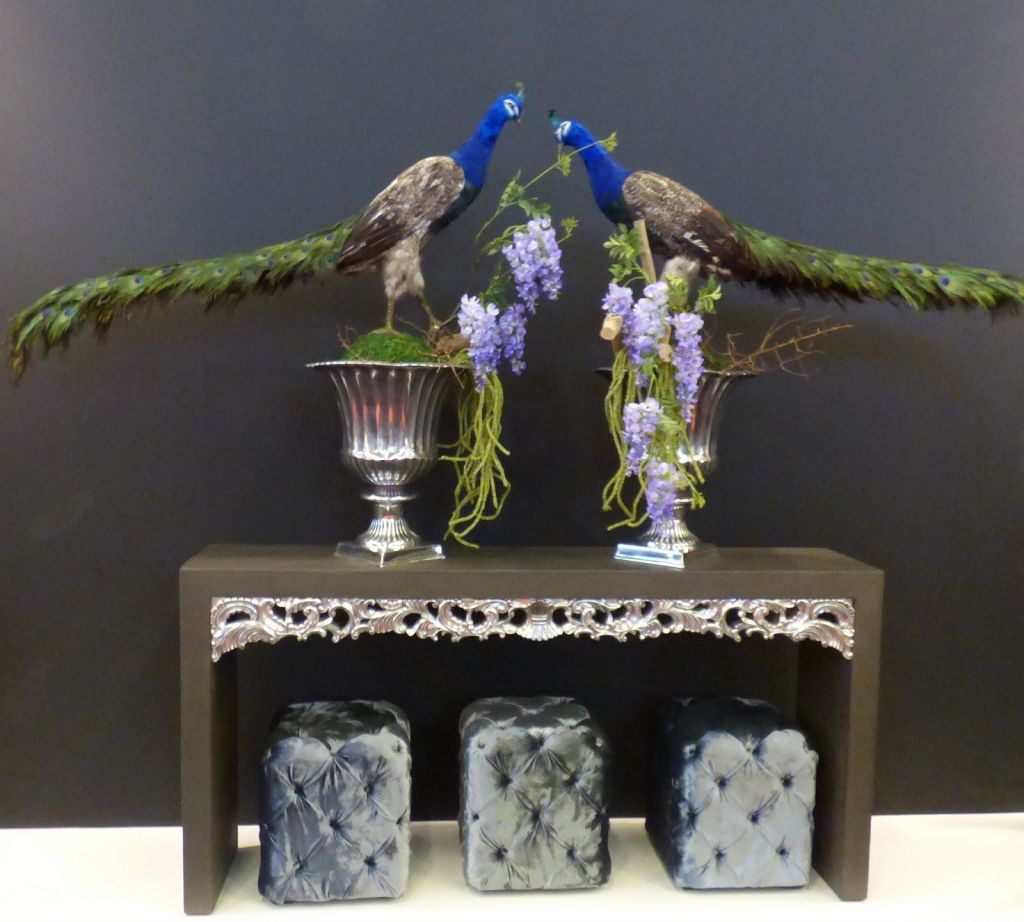
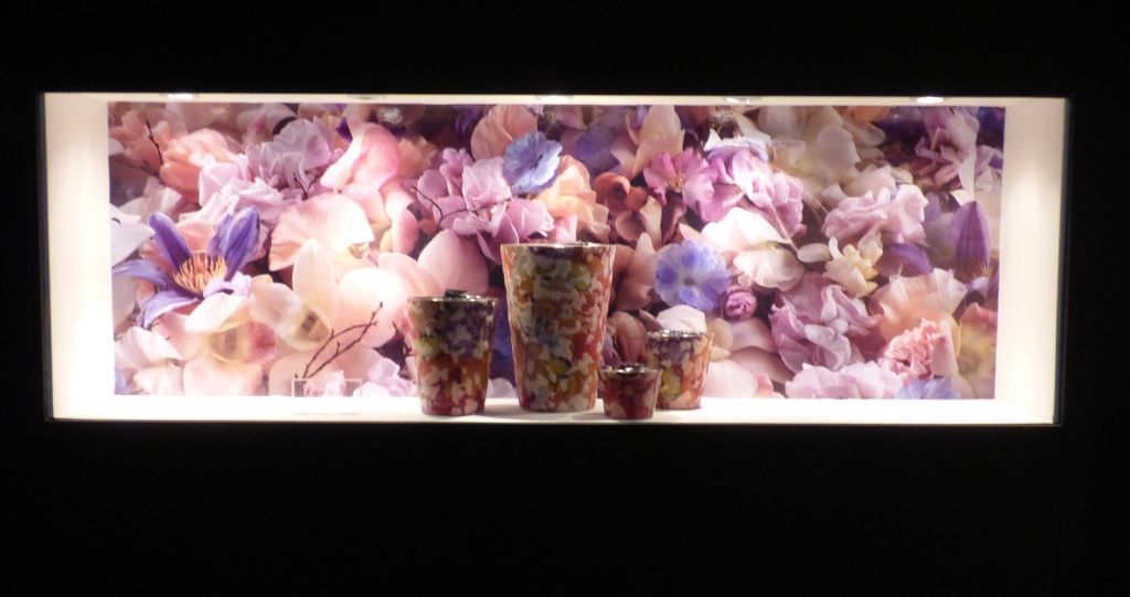
On Friday I spent the day at the big Paris decor salon Maison & Objet …. loads to see, in fact way too much to see in one day, which is why I’m going back tomorrow.
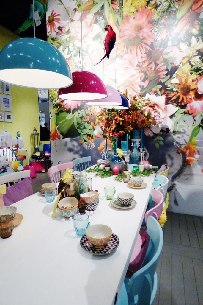
My first impression was c.o.l.o.u.r !!! Gone are the days of neutrals, neutrals and more neutrals. This year the stands are pink, turquoise and bright green. Often against a neutral or black background but colour is definitely back on track!
I thought you may like to see what caught my eye among the accessory stands, and tomorrow I’ll bring you more pictures of another part of the salon, maybe the craft stands and maybe the fabrics …. I’ll see where I end up…
I’d love to know what you think of all of this …. do you think it looks french, or could it honestly be anywhere in the world?…
tomorrow I’ll try to spot the surviving neutrals…
 [white]
[white]
26 comments
Noooo! Please don’t let them take away my neutrals….please…. 😉
Neutrals will always work and you can mix it up with any color you like.
Will never change this color style.
Hello Sharon,
I very much enjoyed seeing what is new for Spring in Paris. Some of it definitely looks French to me, but there is much that could be used here in the US. I love some of the bowls on the table and the colored glasses, and the touch of pink is lovely. However, I am certain that my husband would object to pink in the living room or bedroom. Pink flowers would be fine, but not pillows. I love to change out the decorative pillows on our couch according to the season. The couch is beige, so pillows may be in navy, shades of purple, black, or brown.
Thank you for new inspiration.
Linda
Still loving neutrals but with a pop of colour.
Hmmmm . . . not sure. What vibrant color! Almost tropical. It doesn’t really match up with any of the simple, elegant palettes you’ve shown us from the French countryside. Perhaps it wouldn’t look so out of place in homes along the Mediterranean. But then that’s just my feeling.
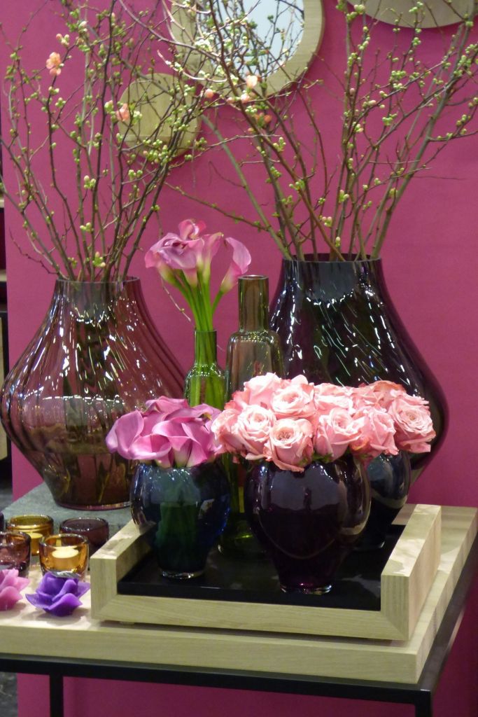
What a wonderful gathering of colours! I love them all. However, the tiny white vases really spoke to me–maybe it’s because I think they would be perfect for a still life painting. 🙂
Wow, gorgeous for certain. I think it looks very California/Palm Springs-like in my opinion. Can’t wait to see more of this place!
Thank you for bringing Maison & Objet to life for us! Love the fresh palettes going on there!
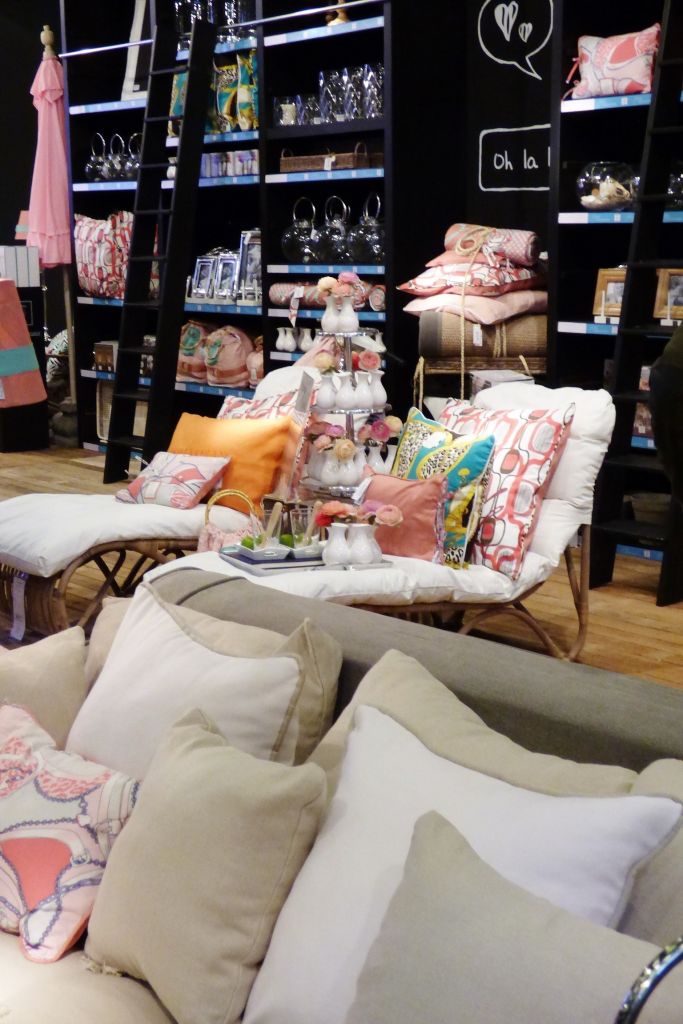
I think the sofa picture , the one above the pheasants is the way to go. Neutral furniture then color in the pillows for a splash. If you get tired of it, it will be inexpensive to have a change of mind. However, I love seeing what is going on so thanks for doing all the hard work for us.
Splashes of colour is appealing at this time of year, the dreary winter makes us want spring. But this mixture of colours and patterns seems too much, as if it was put together specific for retail to catch your attention. The real question is : would you take this home. It’s probably too much of a flash in the pan for most people.
All the wonderful color made me feel really happy. Perhaps it is because we are coming from the dull darkness of winter and it felt spring-like. But I’m not sure so much color all the time is the way to go. At times it might almost feel over stimulating when what I am craving is peace and rest.
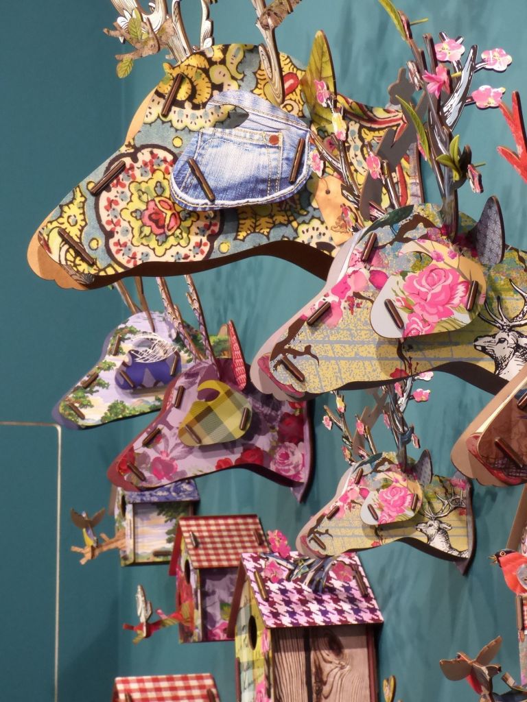
Hi Sharon wow that’s a lot of colour for 1 room, but I think individual items used for a splash of colour would be fine. My daughter bought me one of those bird houses (pic No. 2) it is quite beautiful, i just didn’t like the idea of putting it on the wall. Picture No. 4 I’m thinking candle holders…beautiful. I love the French way of decor because it’s very elegant, I’m not into the gregarious look, I prefer a little drama. Thank you for sharing, I’m going back for a closer look, Regards Esther from Sydney. PS love the look of pic. No. 3
I do like the flowered animal “heads” — that’s the only kind of head I’d want to see on a wall. But however refreshing it all is in its promise of spring, it doesn’t particularly say “France” to me, more like South Florida or Southern California or similar tropical climes. {And I don’t want all the neutrals gone; I’ve just gotten around to painting several rooms that way. 🙂 }
Just love the colors of the table setting, have painted my table white and now to paint the chairs bright colours. Just love receiving your emails. Beautiful.
Vibrant and fun!
Bonjour Sharon. Is the shop similar to Maisons du Monde?
I APPRECIATE THE ARTISTIC TALENT ! BUT … NO !!!!
COULD NOT LIVE WITH IT ! BUT IT IS FUN TO SEE
THANKS FOR SHARING !!!
New to France, perhaps, but not to parts of the United States – like South Florida.
Pier One stores have carried colorful items like this for decades…
I was thrilled to see the explosion of color that you posted. I am one of the few that has resisted painting my rooms in shades of tan, taupe, beige or any of the colors in-between (although I did waiver, at one point). I decided to stay true to myself and paint what I like. For awhile, it was hard to find pure colors of yellow, blue, pink, or red…everything was muted or muddy-looking. I love my palette of colors today as much as when I first painted them. I tried to like neutrals but I just couldn’t. I found them a bit depressing, even as background. It got so I couldn’t buy another decorating magazine, to look at one more neutral-colored room. For me, I say hurray for color! (I think I finally figured out to post to your site. 🙂 )
Oh, I am missing M&O! What a treat and I am loving, loving all the color. Hoping to go in the fall but in the meantime, will follow along here!
this could be anywhere in the world, definitely not a typical French look !!!
I am back living in Sydney, and it could actually be VERY Australian….
Wonderful colorful photos. Although I appreciate design I do not think that I am ready for all of the color in my house.
Have a great time.
Thank you for sharing these beautiful photos Sharon. It looks like an amazing place to visit. I thought that ” the look” seemed very international!
Hello Sharon !
I love the photo 2 …
et le reste, of course !
Merci et belle journée
Mariecapucine
Hi Sharon!!!
I love color!!!! The more the better!!!
I’m glad I wasn’t there because I would have loved the one stand with, “Oh, la la” written on the back black wall. Such gorgeous colors and of course my eye caught the pink right away!!!
It looks like you had a great time!!!
Pam
xox
The three little ottomans. Perfect.